A). The Roles of Visuals in Instructions

•
Visual
can also motivate learners by attracting their attention, holding their attention,
and generating emotional responses.
•
Visual
can simplify information that is difficult to understand.
•
Visual
provide a redundant channel.
B).
Visual Literacy
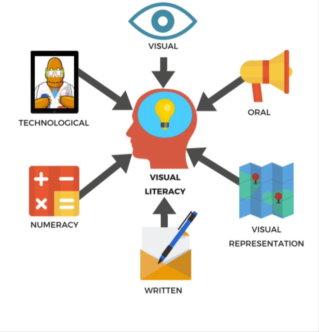
Consider the
sorts of visuals that are used every day for important communication purpose,
such as the emergency information card in airplanes or highway signs that warn
of dangerous curves or obstructions.
They work only
to the extent that you are “literate” in the conventions of that medium.
Whereas the term literacy once was used only to refer to reading and writing of
verbal information.
Today we use the
term visual literacy to refer to the learned ability to interpret visual
messages accurately and to create such messages.
The
critical role of visuals in education was recognized forcefully a century ago
by Jhon Dewey (1987), probably the most influential American Philosopher of
education :
“I believe
much of the time and attention now given to preparation and presentation of
lessons might be more wisely and profitably expended in training the student’s
power of imagery and in seeing to it that he is continually forming definite,
vivid, and growing images of the various subjects with which he comes in
contact in his experience.”
Visual Literacy can be developed though two majors approaches:
- Input
strategies : Helping
learners to decode, or “read” visual proficiently by practicing visual analysis
skills (though picture analysis and discussion of multimedia and video
programs.
- Output
strategies : Helping learners to encode, or “write” to express themselves and communicative with
other (though planning and producing photo and video presentation).
1. Decoding: Interpreting Visuals
a. Developmental effects.

Prior to the age
of 12, children tend to interpret visuals section by section rather than as a
whole, tend to summarize the whole scene and report a conclusion about the
meaning of the picture. Hence, abstract
symbols or a series of still pictures whose relationship is not clearly spelled
out many fail to communicative as intended with younger viewers.
b. Cultural effects.

Different
cultures groups may perceive visual material in different ways.
let’s say your
instructions includes visuals depicting scenes typical of the home life and
street life of inner-city children. It is almost certain that students who live
in such an area will decode these visual differently than will students whose
cultural (and socioeconomic) backgrounds do not include firsthand knowledge of
inner-city living.
c. Visual preferences

People do not
necessarily learn best from the kinds of pictures they prefer to look at.
Research on picture preferences indicates that children in upper elementary
grades tend to prefer color to black and white and to choose photographs over
drawing, younger children tend to prefer simple illustrations, whereas older
children tend to prefer moderately complex illustrations (Myair & Carter,
1979).
d. Encoding: Creating Visuals

Children who
have grown up constantly exposed to movies and television may expect the
visuals they encounter in school to be similarly packaged and sequenced. They
may need practice in arranging visuals into logical sequence, which is a
learned skills, like the verbal sequencing in reading and writing. This chapter
focuses on understanding visual design and doing visual displays into creative
activities.
e. Visual Literacy Education

Media production, computer design and critical thinking skills can enhance students’ abilities to work and succeeded in an increasingly visual world. (diagram, hidden pictures, memory games, and video clips) to work alone or together on visual learning activities and develop communication, organization, and reporting skills in the procces.
C). Goals of Visual Design
1. Ensure
Legibility
The goal of good
visual design is to remove as many
obstacles as possible that might impose transmission of your message (
specific guidelines on, for example, the size of letters appear later in this
chapter.
2. Reduce
Effort
You will see how
establishing an understanding pattern (alignment, shape, balance), putting like
things together (proximity), and following a regular pattern in your treatment
(consistency) contribute to this goal.
Using harmonious
color combinations and figures that contrast with their background also play
roles.
3. Increase
Active Engagement
Choosing a style
appropriate for your audience and using appealing color schemes also will help
you gain and hold your audience.
4. Focus
Attention
The overall
design pattern plus specific directional guides (woven into the design and
color cues) are your means for achieving the goal of focusing attention.
D). Process of Visual Design
1. Elements
We have grouped the following design suggestions according to the various elements or components of the display; the visual elements (choosing the type of visual), the verbal elements (lettering style and location), and the elements that add appeal (Surprise, texture, interaction).
a. Visual Elements
Realistic visuals show the actual object under study. For example, the color photograph of a covered wagon in figure 5.13 in a realistic visual.
Realistic visuals show the actual object under study. For example, the color photograph of a covered wagon in figure 5.13 in a realistic visual.

Analysis visuals
convey a concept or topic by showing something else and implying a similarity.
Such visuals help learners interpret new information in light of prior
knowledge and thereby facilitate learning.
b. Verbal Elements

Most
displays incorporate some type of verbal information in addition to visuals. At
a minimum, you have to be sure that the lettering is legible in terms of size
and spacing and of a style that is consistent with your intended message.
1. Letter
Style

The
style of the lettering should be consistent and should harmonize with the other
elements of the visual.
2. Number of Lettering Styles

A display-or a
series of related visuals, such as a slide series-should use no more than two
different type styles, and these should harmonize with each other.
3. Capitals

For best legibility,
use lowercase letters, adding capitals only where normally required.
4. Color of Lettering

As discussed later in the section “Figure-Ground Contrast”, the color of the lettering should contrast with the background color both for the sake of simple legibility.
5. Size of Lettering

Displays such as bulletin boards and posters are often meant to be viewed by
people situated at a distance of 30 or 40 feet or more.
6. Spacing Between Letters

The distance between the letter of the individual words must be judged by
experience rather than on a mechanical basis.
7. Spacing between lines

The vertical spacing between lines of printed material is also important for
legibility.
8. Elements that add appeal

Your visual has
no chance of having an effect unless it capturea and holds the viewer's attention.
2. Pattern
The idea to
establish pattern is to decide how the viewer's eye will flow across the
display. The major factors that affect the overall look are alignment of
elements, shape, balance, color scheme, and color appeal.
a. Alignment
: when you position the primary elements within a display so that they have a
clear visual relationship to each other, viewers expend little effort making
sense out of what they are seeing and are free to concentrate on understanding
the message being conveyed.
b. Shape
: put them into a shape that is already familiar to the viewer.
c. Balance
: when the “weight” of the elements in a display is equally distributed on each
side of an axis, either horizontally or vertically or both.
d. Style
: different audiences and different settings call for different design syles.
Color
scheme : when choosing a color scheme for a display, consider the
harmoniousness of the colors.
e. Color
appeal : artists have long appreciated that blue,green, and violet are
considered “cool” colors, whereas red and orange are considered “warm” colors.
3. Arrangement
Arranging the individual elements within the
underlying pattern.
a. Proximity
: putting related elements close together and moving unrelated.
b. Directionals
: viewers scan a display, with their attention moving from one part to another.
c. Figure-Ground
Contrast : that dark figures show up best on light grounds and light figures
show up best in dark grounds.
d. Consistency
: as viewers go through the series of images they begin unconsciously to form a
set of rules about where information will appear in your display.
E). Visual Planning Tools
1. Storyboards
Several related overhead transparencies, a slide set, a video sequence, or a series of computer screens. This technique, borrowed from film and video production, allows you to creatively arrange and rearrange a whole sequence of thumbnail sketches.
Several related overhead transparencies, a slide set, a video sequence, or a series of computer screens. This technique, borrowed from film and video production, allows you to creatively arrange and rearrange a whole sequence of thumbnail sketches.
2. Types of Letters

The simplest is freehand lettering with markers and felt-tip pens, which come in an array of colors and sizes. You also may use an available dekstop publishing system to prepare lettering in various styles and sizes.
3. Drawing, Sketching, and Cartooning

There are many sources of these in magazines, textbooks and advertising. Those are sources that can help you communicate effectively using those graphic media.
F).
Digital Image
As a computer technologies advance,creating visual images has moved into the digitalcamera to created original or may transfer images into digital formats using scaners. Digital images allows users to capture,edit,display share and network still and video images.
As a computer technologies advance,creating visual images has moved into the digitalcamera to created original or may transfer images into digital formats using scaners. Digital images allows users to capture,edit,display share and network still and video images.
a. Digital Cameras

Digital cameras are small and lightweight with fewer moving parts than traditional cameras.instead of aquinting thought a tiny optical viewfinder,mosttal cameras permit you to see a large images display on the back of the camera before you take the picture.
b. Scanners

Scaners work with computers to transfer easisting visual images,such as drawings or photographs,students may quickly inscoeporate scanned images into a word processing file or enhance or change them using software.
Source : Heinich, Molenda, Russell, Smaldino et. 2002. Instructural Media and Technologies for Learning volume 7. California: The University of California.
Tidak ada komentar:
Posting Komentar